In this tutorial, we take a look at a beautiful
parallax scrolling effect in the simplest of ways, with stationary
backgrounds and scrolling content.

A Brief Introduction
Parallax is an effect where the position of an object seems to be different when viewed from different positions. Parallax motion, or in our case, parallax scrolling, then gives us the illusion that two objects in the same line of sight, but with distance between them, seem to move at different speeds. If you’ve ever looked out a car window while driving at 100 km per hour down a highway, you’ll notice that the electricity poles seem to zip by at a high pace, while the mountains in the background seem to move by really slowly, almost at a standstill. This is parallax motion in action.As far as the web goes, we can induce a parallax effect on containers that have background images and text above them. In its simplest form, parallax scrolling will cause the content to scroll as normal, and the background to remain stationary. The beauty about this technique in its simplest form is that it only requires CSS. Let’s dig in.
The Markup & Structure
If you had a fixed with site that was non-responsive, then there would be no trickery to achieve this. We’re in the age of responsive web design though, so that’s a no-go. Fear not! We have some nice CSS at our disposal. But first, a look at some markup. The markup is simple – we’ll have alternating background/heading-textsections and content sections for maximum effect. Here’s what it looks like:<section class="module parallax parallax-1">
<div class="container">
<h1>Serene</h1>
</div>
</section>
<section class="module content">
<div class="container">
<h2>Lorem Ipsum Dolor</h2>
<p>Lorem ipsum dolor sit amet, consectetur adipisicing elit...</p>
</div>
</section>
<section class="module parallax parallax-2">
<div class="container">
<h1>Rise</h1>
</div>
</section>
<section class="module content">
<div class="container">
<h2>Lorem Ipsum Dolor</h2>
<p>Lorem ipsum dolor sit amet, consectetur adipisicing elit...</p>
</div>
</section>
<section class="module parallax parallax-3">
<div class="container">
<h1>Calm</h1>
</div>
</section>
<section class="module content">
<div class="container">
<h2>Lorem Ipsum Dolor</h2>
<p>Lorem ipsum dolor sit amet, consectetur adipisicing elit...</p>
</div>
</section>
section with a class of parallax will contain our background images and heading text, while each section with a class of content will be simple content-containing sections. The container class is a fluid div with a maximum width, making the responsiveness of it all very simple. Now, let’s dig into the CSS.Styling & Making It Work With CSS
The first point to note is that all of my background images have awidth of 1600px and height
of 600px. That allows me to set my parallax sections to a fixed height
of 600px. There’s a bit more than that to it though. Because I don’t
want repeating backgrounds (I’m using big and bold images), I can’t
always expect users to be at maximum width (which will allow the
background images to be in full view). Luckily for us, we can utilise
the CSS background-size property, and set it to cover.
This forces the background image to occupy the total available space by
expanding it proportionally. It needs to be prefixed for maximum
support though, so be mindful of that.So far so good, except for the most important thing. We need our background image to remain fixed in place while our content scrolls past it. Again, CSS makes life easy for us. We utilise the
background-attachment property and set it to fixed. Simple! Here’s what my CSS looks like, with some example media queries:/* ============================================================
PRIMARY STRUCTURE
============================================================ */
.container {
max-width: 960px;
margin: 0 auto;
}
/* ============================================================
SECTIONS
============================================================ */
section.module:last-child {
margin-bottom: 0;
}
section.module h2 {
margin-bottom: 40px;
font-family: "Roboto Slab", serif;
font-size: 30px;
}
section.module p {
margin-bottom: 40px;
font-size: 16px;
font-weight: 300;
}
section.module p:last-child {
margin-bottom: 0;
}
section.module.content {
padding: 40px 0;
}
section.module.parallax {
height: 600px;
background-position: 50% 50%;
background-repeat: no-repeat;
background-attachment: fixed;
background-size: cover;
}
section.module.parallax h1 {
color: rgba(255, 255, 255, 0.8);
font-size: 48px;
line-height: 600px;
font-weight: 700;
text-align: center;
text-transform: uppercase;
text-shadow: 0 0 10px rgba(0, 0, 0, 0.2);
}
section.module.parallax-1 {
background-image: url("../img/demo/_small/1.jpg");
}
section.module.parallax-2 {
background-image: url("../img/demo/_small/2.jpg");
}
section.module.parallax-3 {
background-image: url("../img/demo/_small/3.jpg");
}
@media all and (min-width: 600px) {
section.module h2 {
font-size: 42px;
}
section.module p {
font-size: 20px;
}
section.module.parallax h1 {
font-size: 96px;
}
}
@media all and (min-width: 960px) {
section.module.parallax h1 {
font-size: 160px;
}
}
--http://callmenick.com/2014/02/18/create-an-animated-resizing-header-on-scroll/---------------------------------------
background-size property to make it happen; no JavaScript needed.
View Demo
Download Source from GitHub
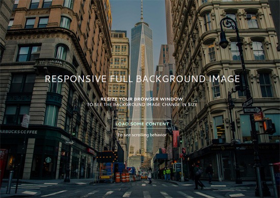
Examples of Responsive Full Background Images
Having a large photo that covers the entire background of a web page is currently quite popular.Here are a few websites that have responsive full background images:
 Sailing Collective
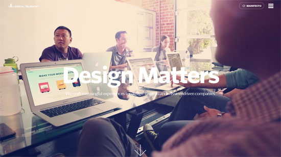 Digital Telepathy
responsive website moving content and fixed image in background
No comments:
Post a Comment